

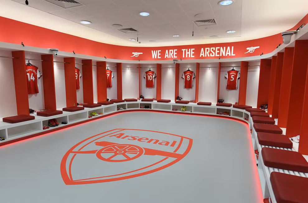
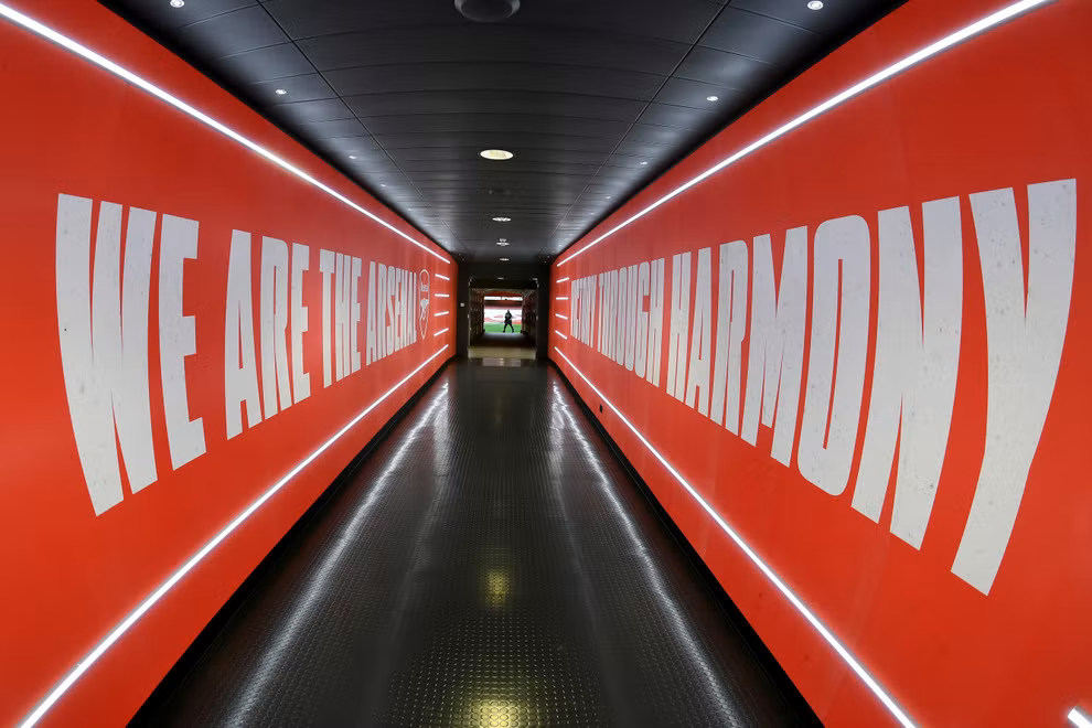
arsenal fc brand guidelines
One of the defining moments in my career was leading the update of Arsenal's brand guidelines for the digital age.
With millions of people worldwide invested in this iconic brand, the opportunity to contribute to its legacy was both an honour and a privilege. By ensuring that Arsenal's visual identity was not only preserved but enhanced for the digital landscape, I was able to make a meaningful impact on the brand's future success. It's moments like these that drive me to continue pushing boundaries and delivering purposeful creative solutions.


the crest.
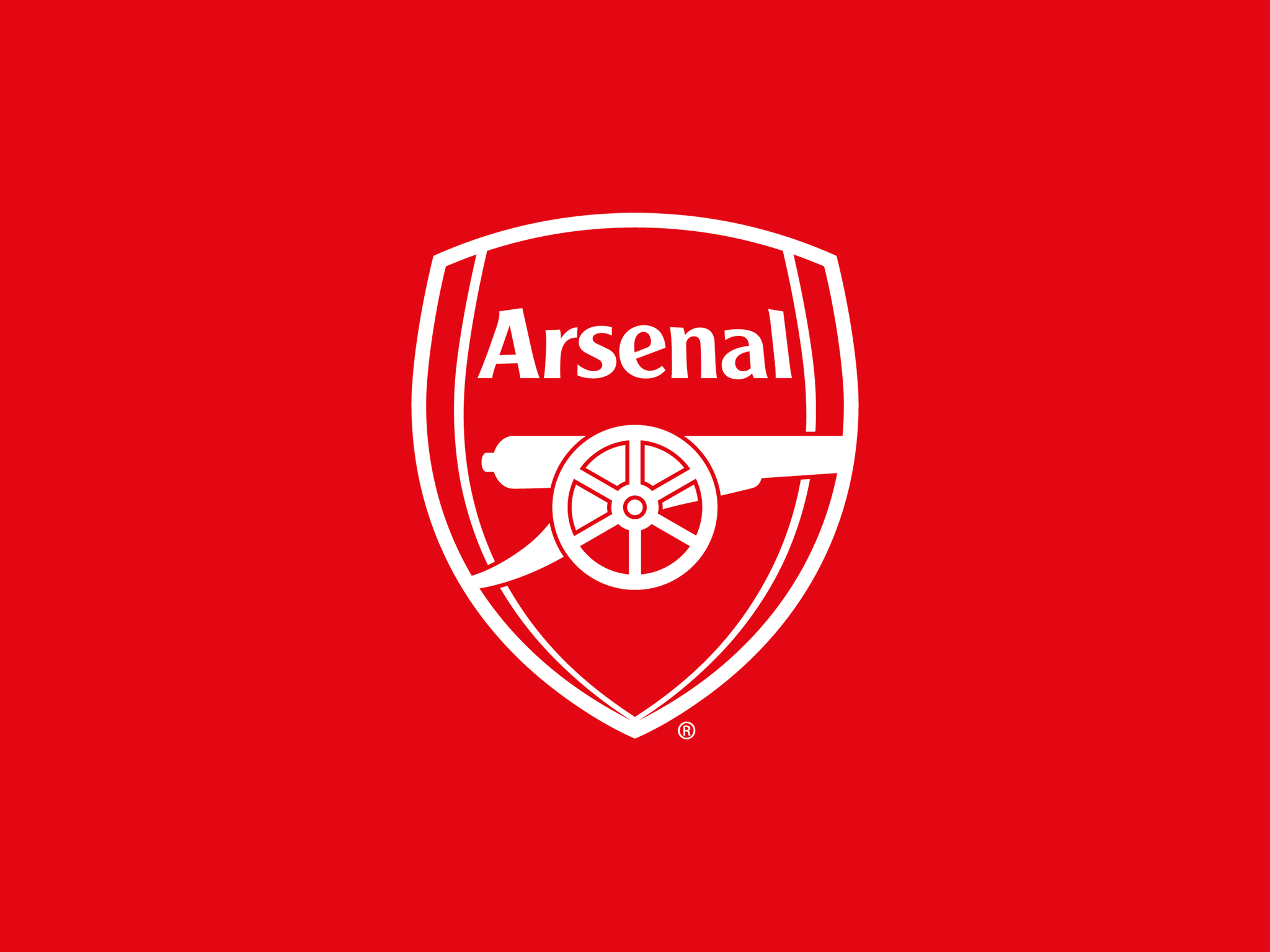
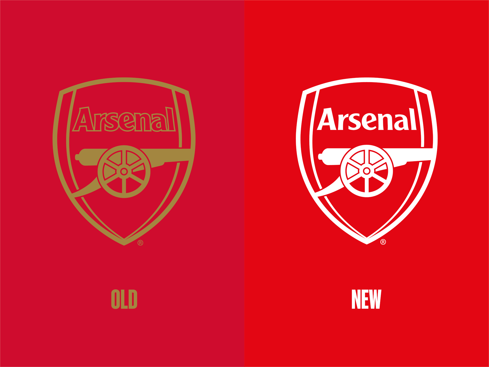
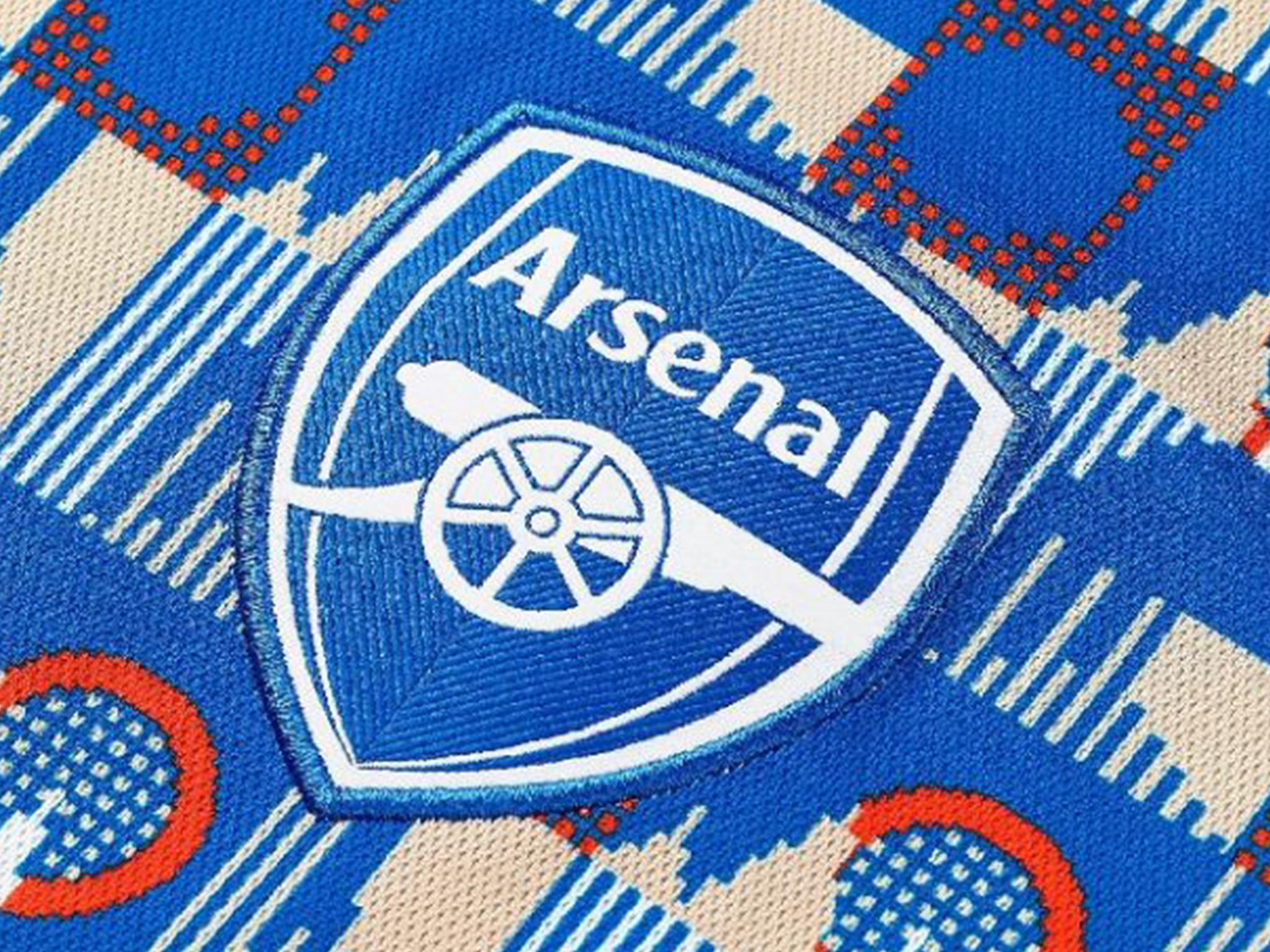
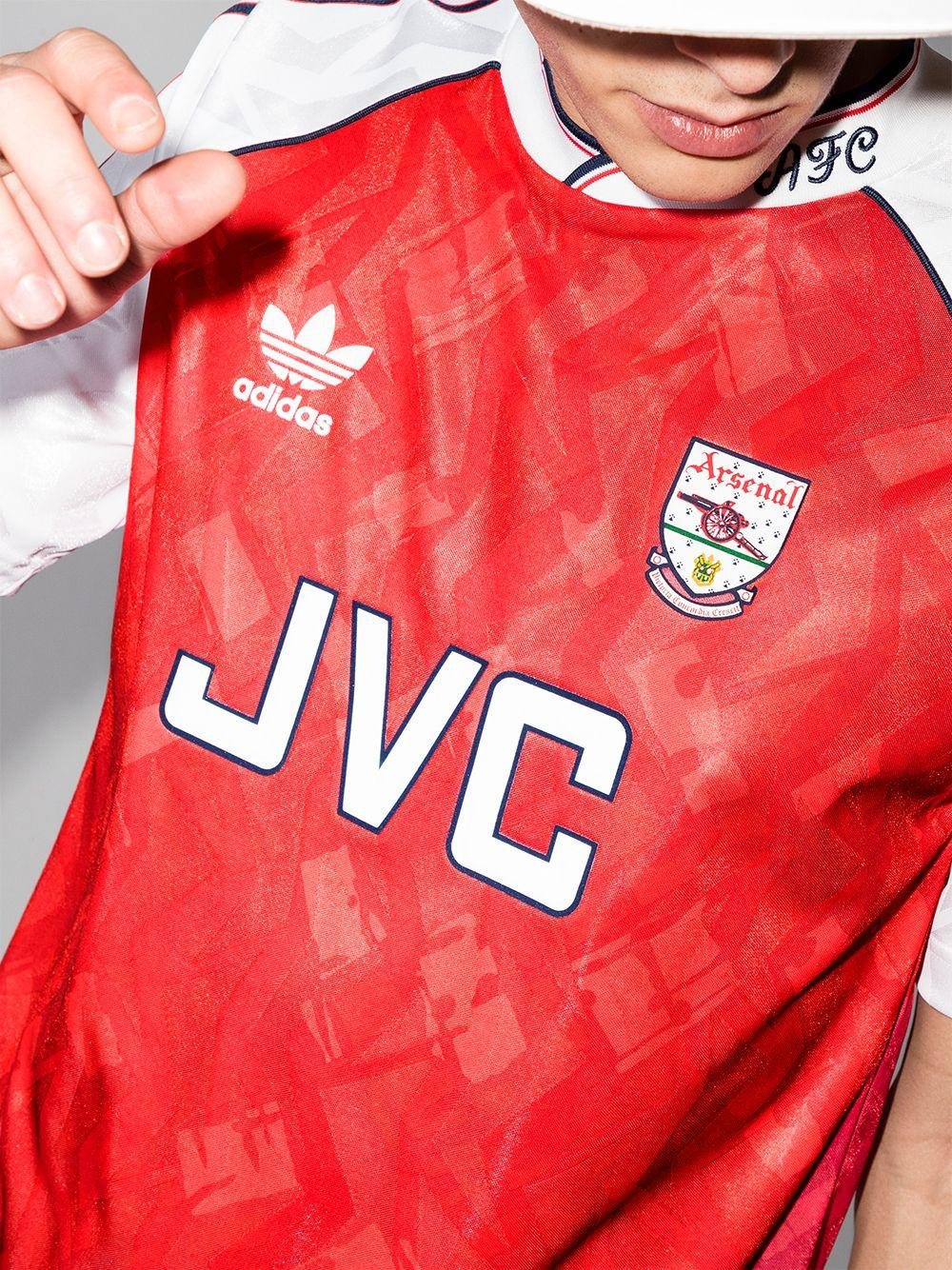
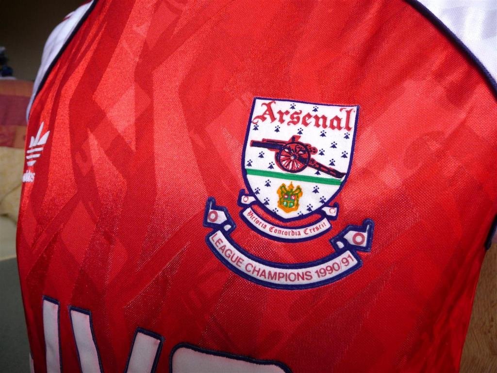
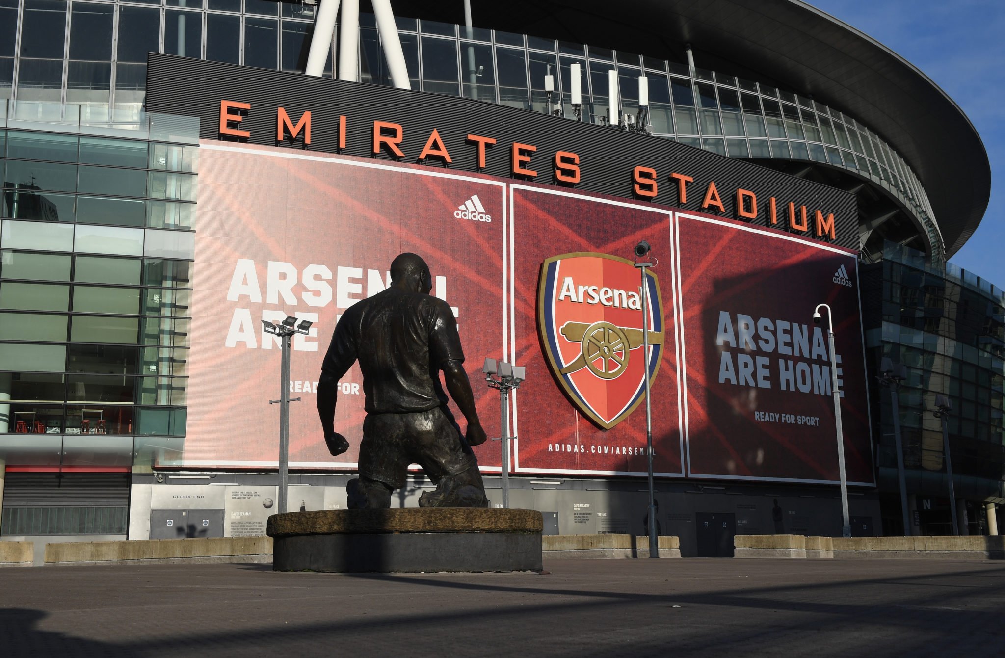
The Arsenal crest is a historic symbol which holds tremendous meaning for fans worldwide. The current crest was developed in 2002, primarily for use in full-colour on clothing and printed media. In an increasingly digital world, the crest has been crying out to be modernised for use at smaller sizes.
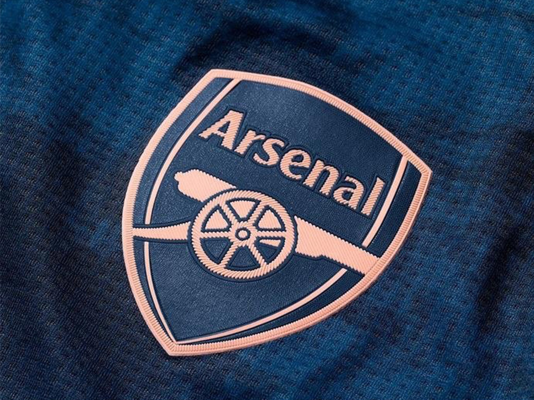
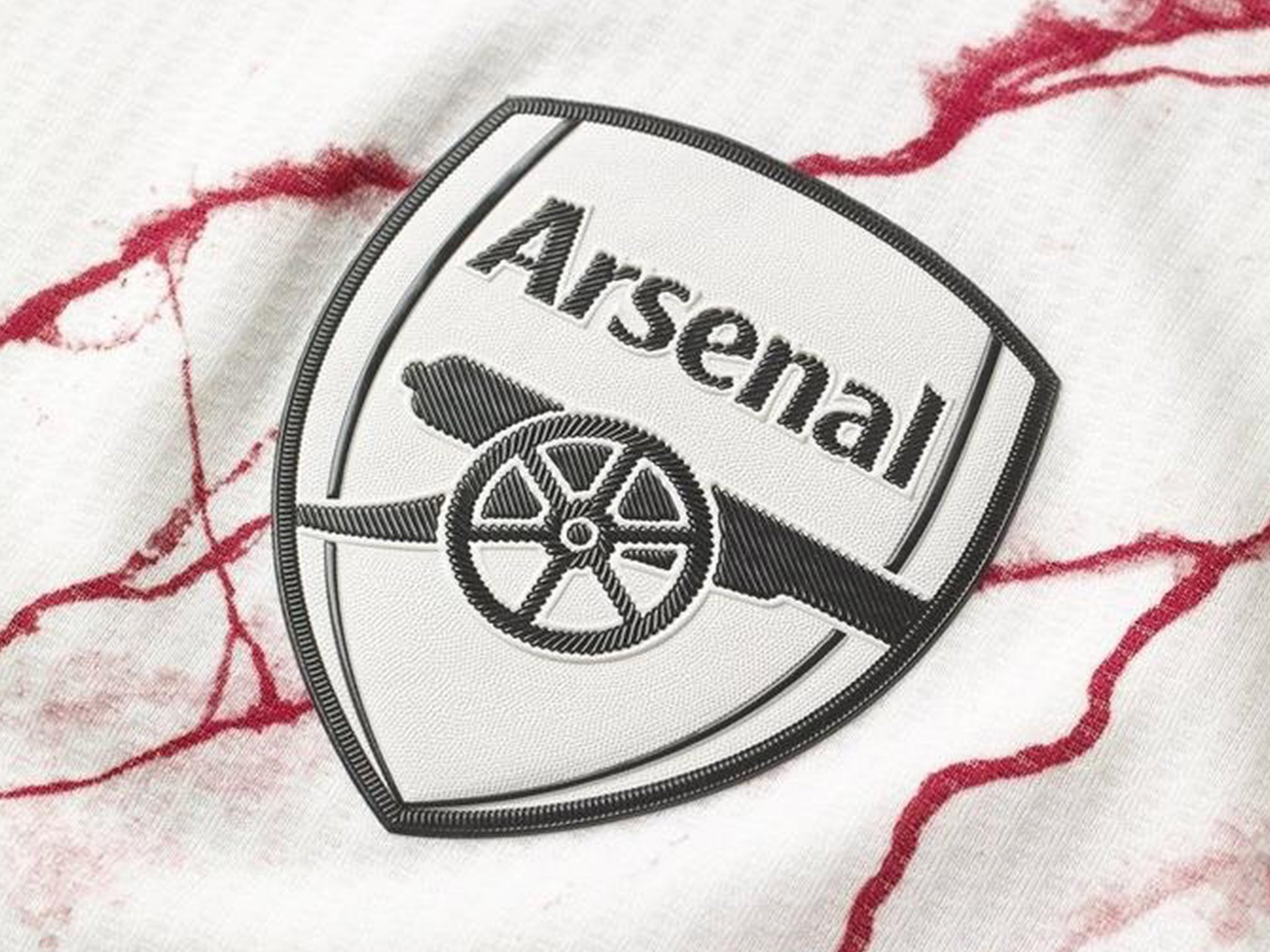
Working in conjunction with adidas, Arsenal’s kit partner at the time, the decision was taken to fill in the outlined text on the badge, giving it higher visibility at smaller sizes. This also opened the door to use the badge in multiple different colours, depending on the style of kit and providing the Arsenal brand with the flexibility which is essential in the modern footballing world.


the canon.
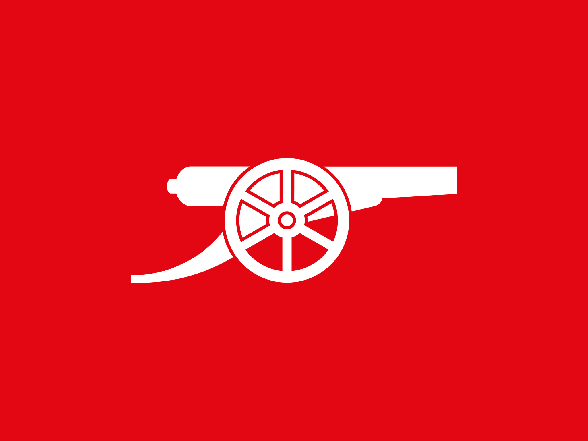
The most iconic symbol of Arsenal and the consistent visual element of the club since 1905. The cannons on the original crest were obviously a reference to the military influence in Woolwich and despite the club’s ties with the area being cut 89 years ago, the cannon theme has developed throughout the years and has remained prominent on the Gunners different crests down the years, including the new design.
The canon from the redesign has become slightly dated in the last 20 years, with the original guidelines showing a two-colour option for the symbol, which can become illegible at smaller sizes on digital formats. We removed the stroke, enabling the icon to be used in single solid colours and introduced more flexibility to the brand.


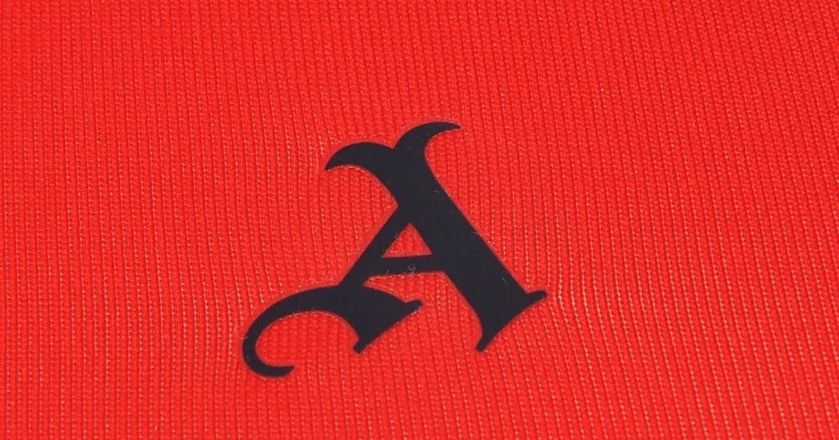
the GOTHIC A.
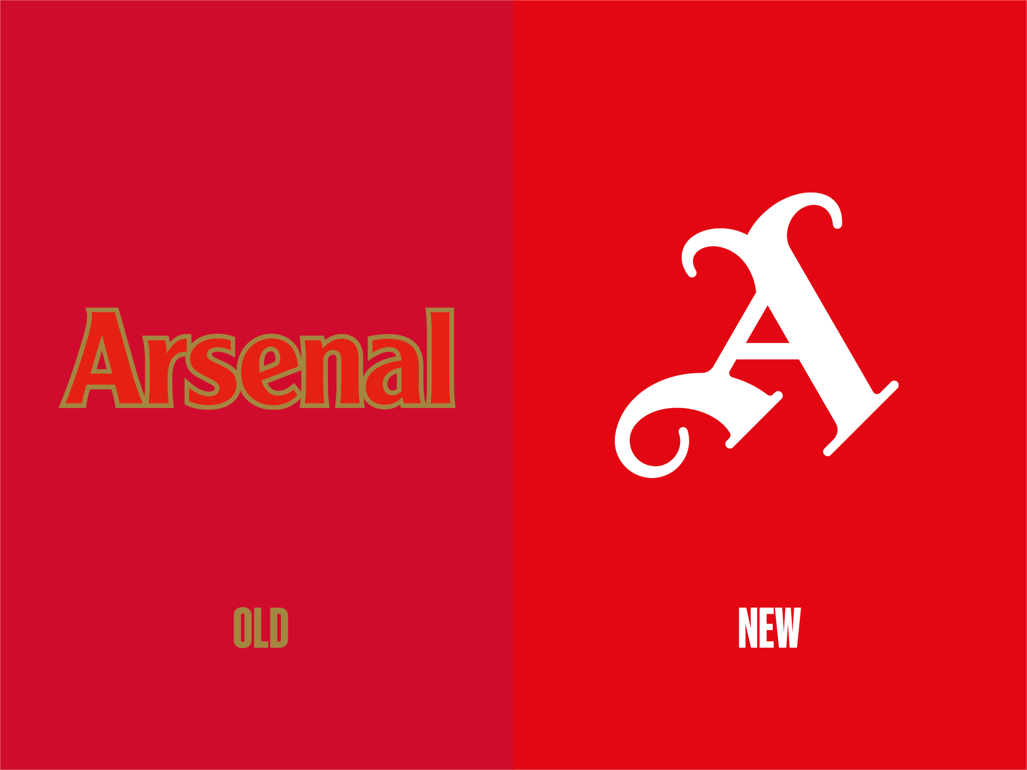
The letter ‘A’ in a gothic typeface was a consistent element of the club’s identity for 50 years or so, until the rebrand in 2002. We brought back the fan-favourite symbol for the brand update, replacing the now-dated typography with a timeless symbol.
One of Arsenal’s longest-serving and most experienced graphic designers re-drew the ‘A’ using multiple references from past typographic versions, creating an incredibly visually appealing character and the most quintessential Arsenal ‘A’ possible.


the ermine.
The ermine is a historic symbol which was worked into the Arsenal crest sometime around the middle of the 20th century. The linings of medieval coronation cloaks and some other garments, usually reserved for use by high-ranking peers and royalty, were made by sewing many ermine furs together to produce a luxurious white fur with patterns of hanging black-tipped tails.
Along with the decision to bring back the gothic ‘A’, we incorporated the ermine back into the visual identity of Arsenal. The use of the symbol gives designers another element to create dynamism in visuals, whilst staying true to the club’s history.

colours & typography.
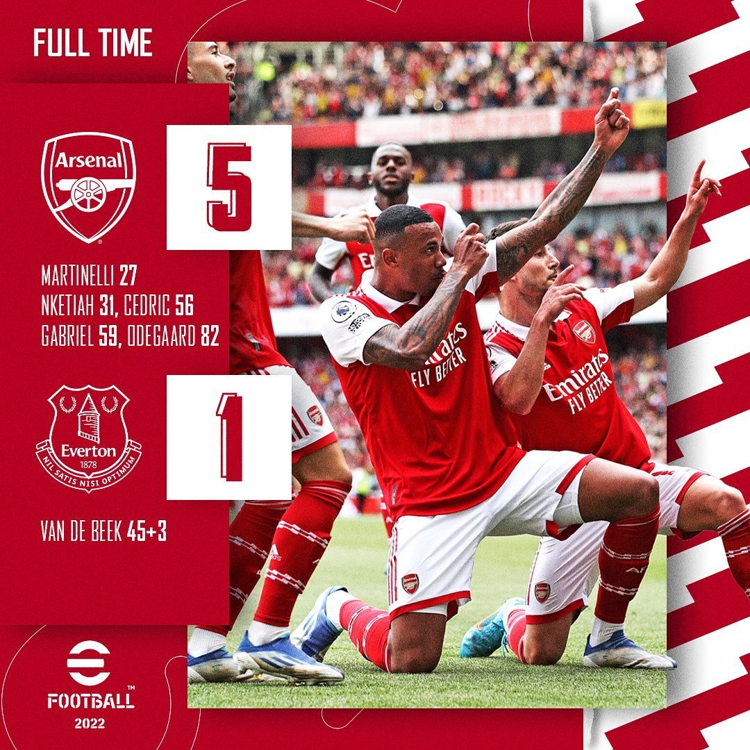
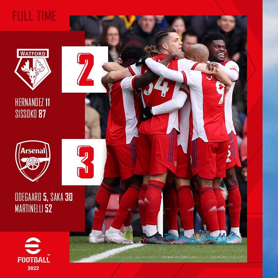
We updated the colours to include three shades of ‘Arsenal red’ from throughout the many years of iconic jerseys. Keeping the colour scheme strict to red for the majority of our graphics, opens up the possibility using the relative season’s away strip colours for special graphics, adding more flexibility to the brand.
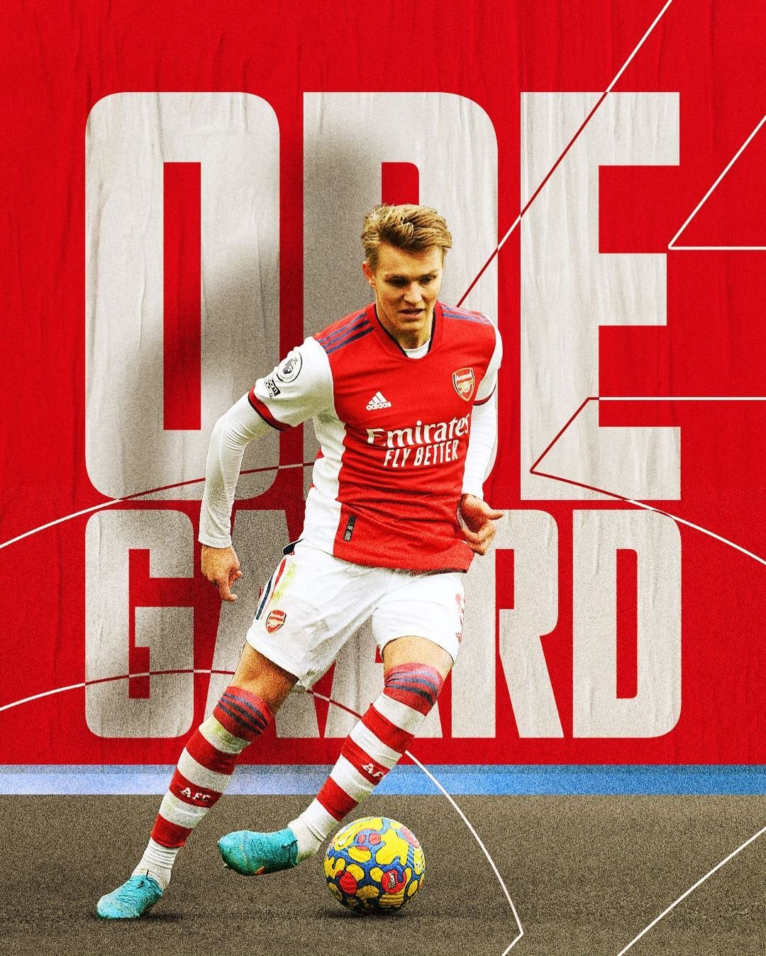
Agency FB has been the font of Arsenal since the rebrand in 2002. We opened up the possibility to include more weights of the iconic font in designs, and omitted the use of tertiary fonts which has confused the brand in previous years.


Agency
Arsenal FC
Aim
Update the Arsenal brand guidelines to reflect Arsenal’s identity in the digital world.
Solution
A considered brand identity which uses Arsenal’s past symbolism in a refined way to drive the historic club into the future.
Team
Arsenal FC Internal Creative Team